Million Lords – Mobile game
Million Lords
Mobile MMORTS game
April 2018 – Today
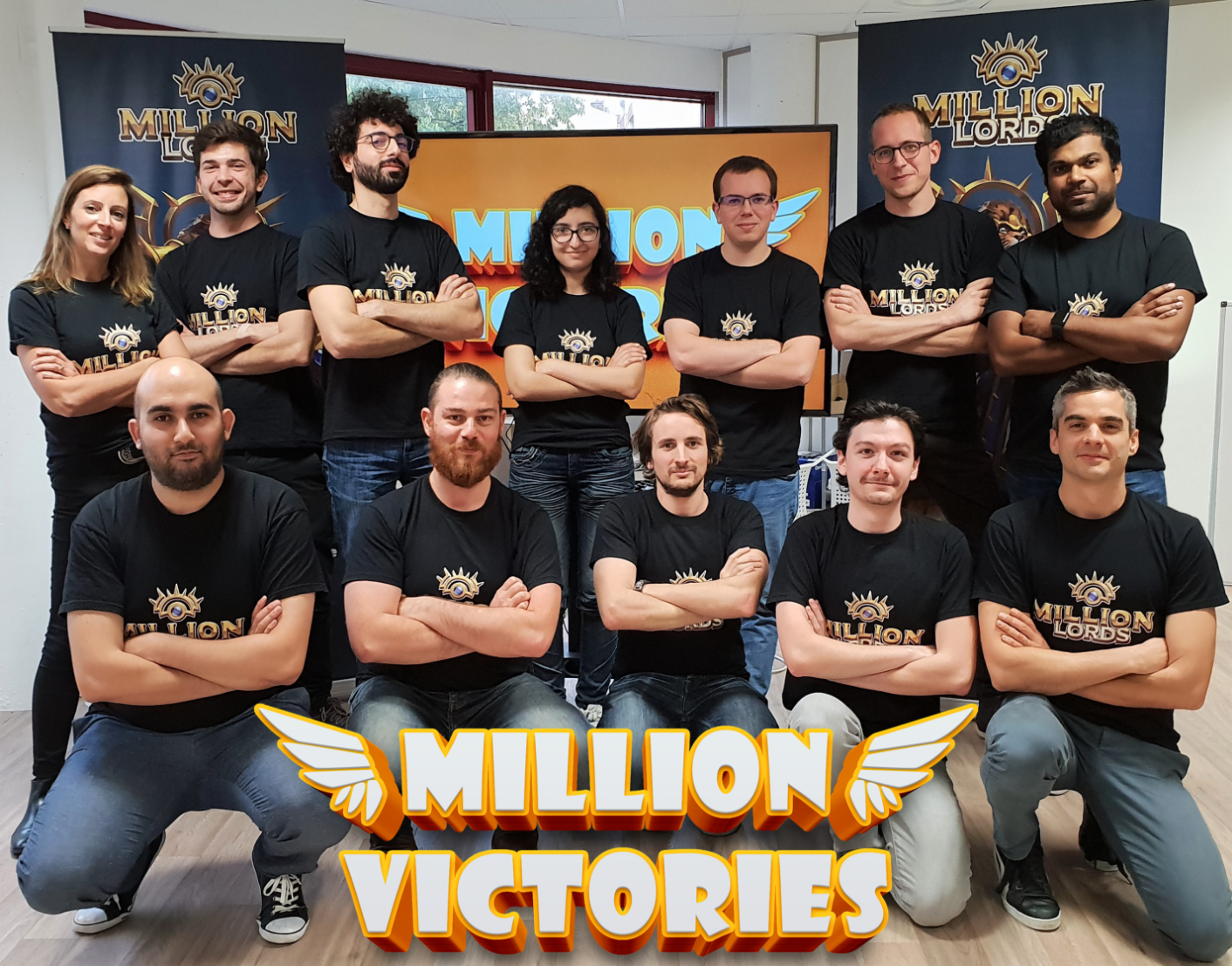
Presentation of Million Victories
Million Victories is an independent game studio created in July 2017 and based in Lyon, France.
We set out to create challenging, dynamic and most of all fun MMO games on mobile.
We are an ambitious studio breathing new life into the strategy genre with its first game, Million Lords, an innovative MMORTS on iOS and Android.
Presentation of Million Lords
Million Lords is a riveting, breath-catching, new real time strategy, massively multiplayer online game of a new genre: no timer, no resources to collect, everything is about conquest, fun and strategy.
Whether you prefer slaying everyone standing in your way or making alliances, to be a merciless or a merciful Emperor: everything is possible.
Claim territories in the Three Lands realm, either alone or with a clan. Choose your skills, play with your brotherhood and become the mighty ruler of the Three lands.
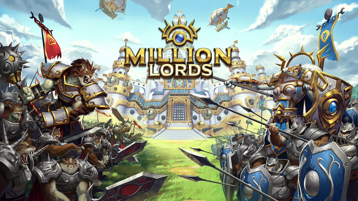
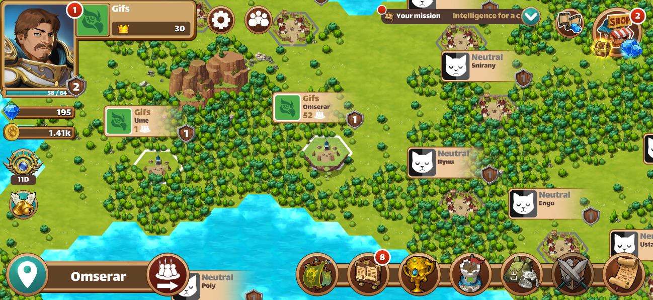
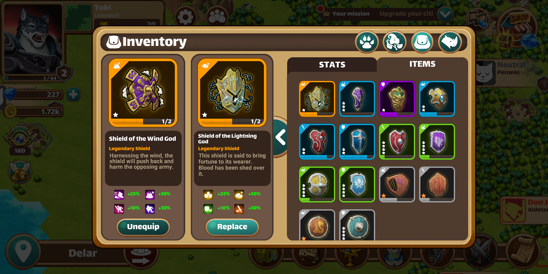
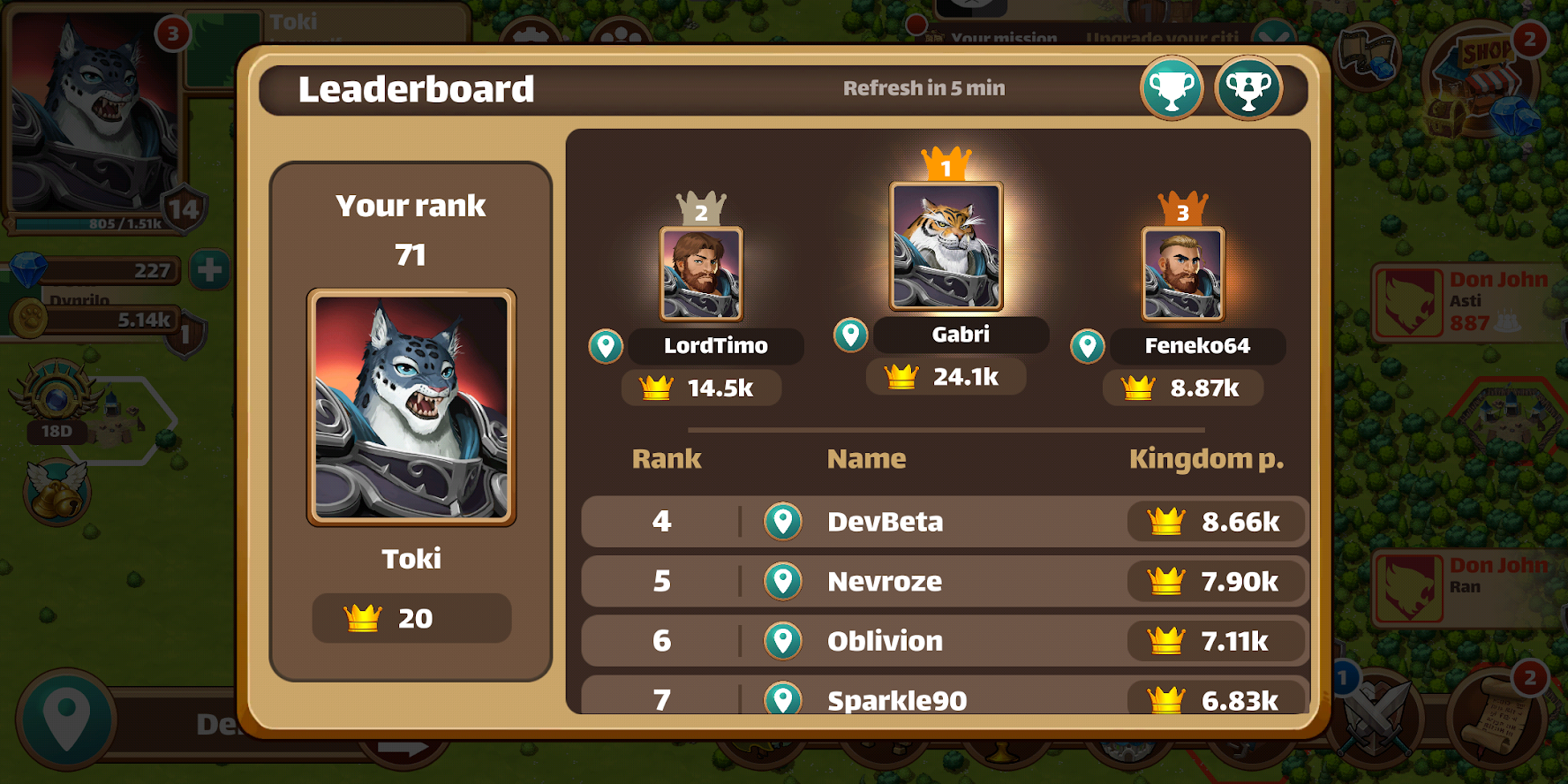
Screenshots of the game
What I do in Million Lords
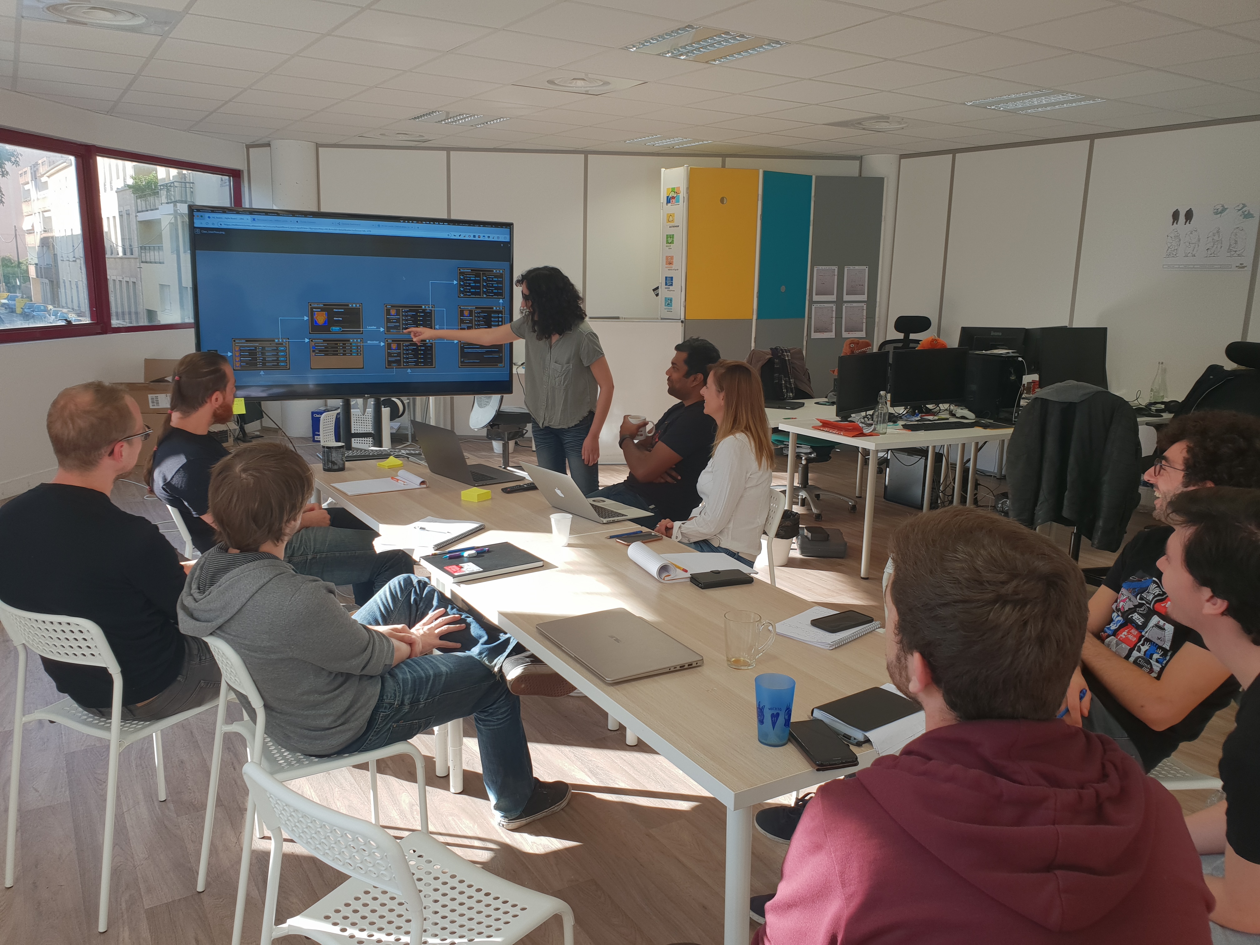
My job on Million Lords is Ux/UI Designer and Integrator. I work closely with the game designer in order to improve the User Experience but also to create and implement new features in the Game Interface.
I notably make Mockups and User Flows. I also work with our artist to build smooth and clear interfaces for the users all the while respecting the Good Practices and Human Interface Guidelines.
After validating the designs with the team, I integrate the UI assets on Unity, the game engine, and try to optimize the assets to the best of my ability to keep the app lightweight while keeping them in good quality;
Due to the studio being rather small, I sometimes work on more diversified missions such as creating Feedback Animations, Particles Fx, Assets Improvement, Localization Management, and much more!
1. User research and Ux design
One of the first missions I did for Million Lords was a user research focused on new players discovering and understanding the game interface.
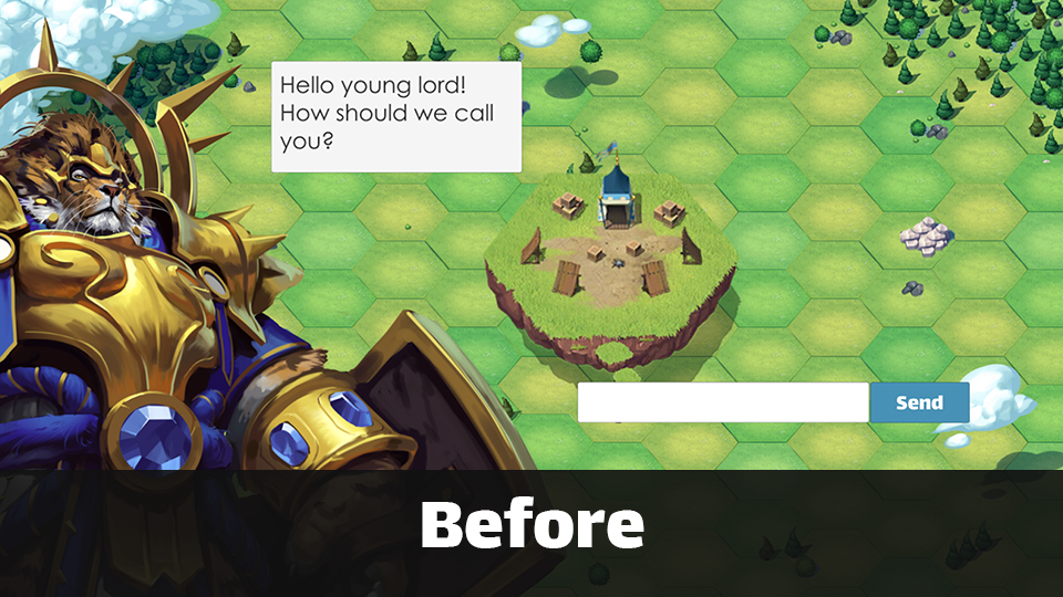
User research
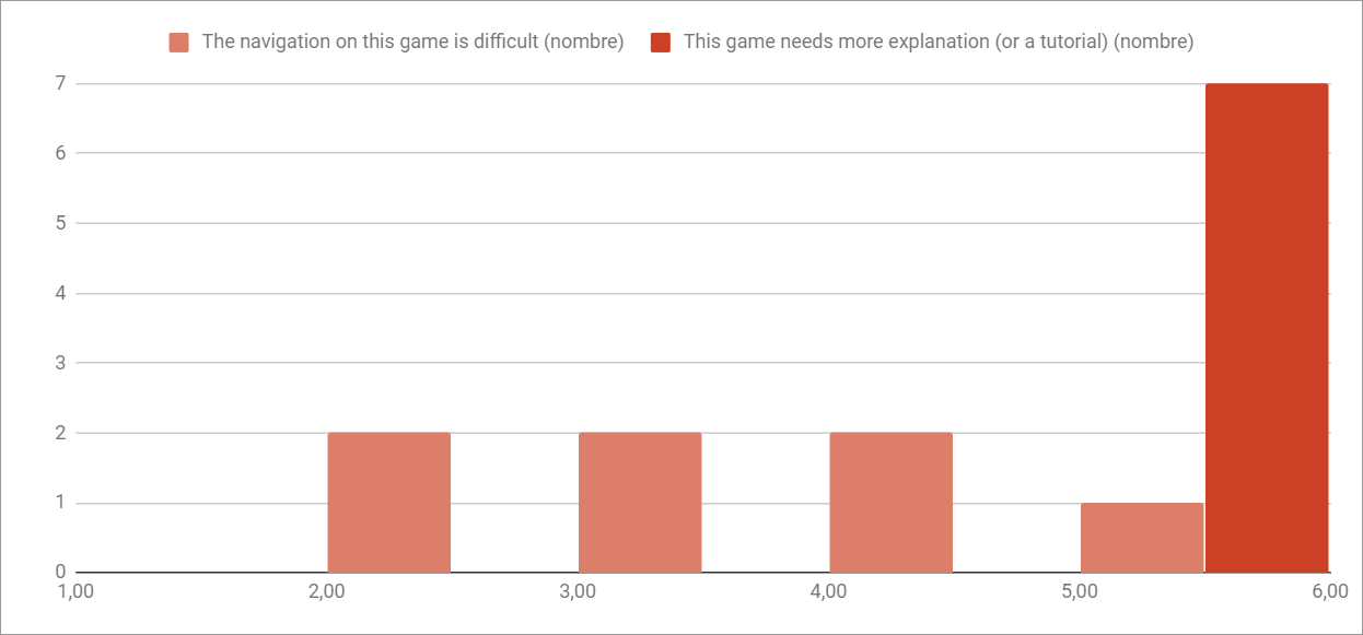
The goal of this research was to understand what new players feel on their first experience and to get a comprehensive list of issues to fix. The first thing I did was a survey to know the satisfaction of the players on the interface and the onboarding in general, I then interviewed them to get more qualitative data. I gave the players different scenarios to do on the game and observed them, then wrote down all the difficulties they found while doing these missions.
Experience maps
The results showed that the game needed more guidance and that some important information wasn’t clear enough for the players.
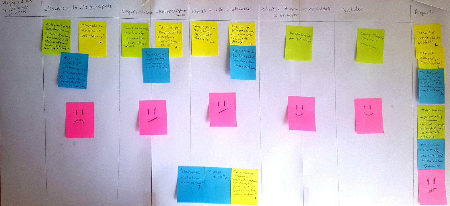
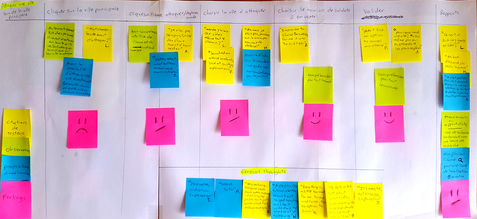
To visualize the testing results and to understand the behavior that the testers used to accomplish the goals of every scenario, I created multiple experience maps, in which I wrote the friction points that I had observed and verbatims of the players in each step of these scenarios. In addition, I wrote down the opportunities and ideas suggested by the players to improve the onboarding.
Step-by-step tutorial
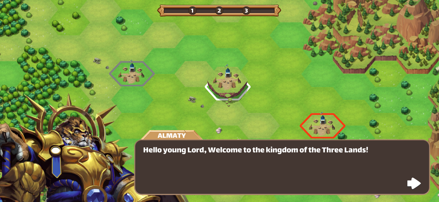
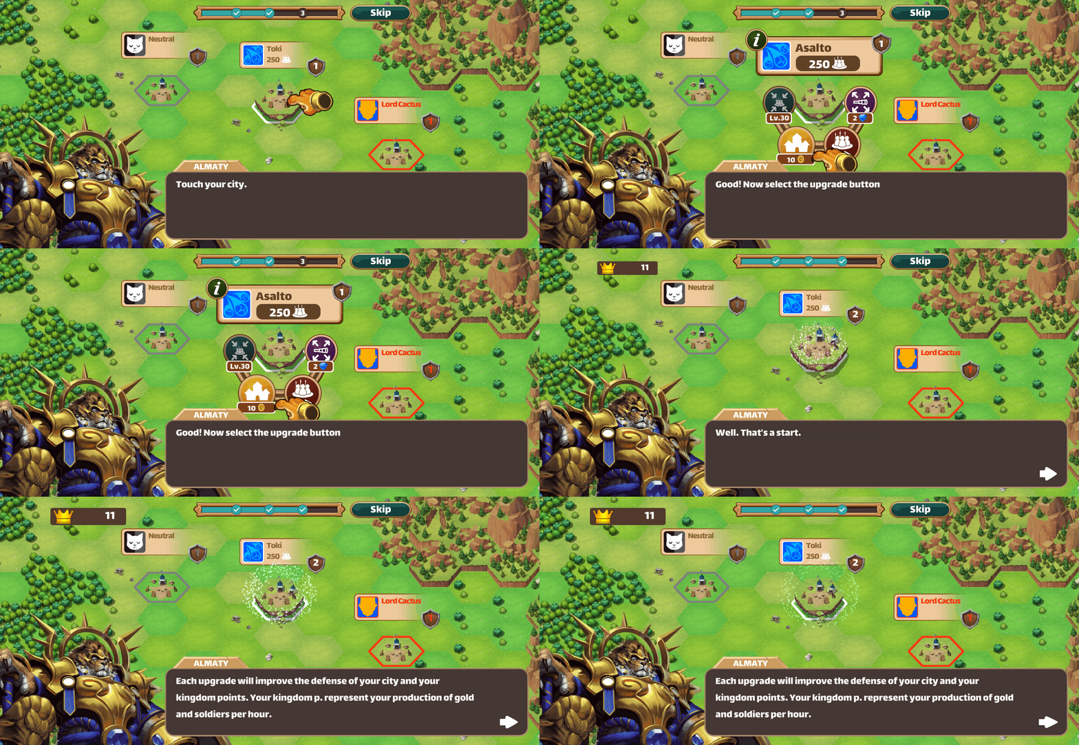
To improve new players’ experience, we added a step-by-step tutorial that is later accessible in the settings panel for everyone to rewatch. This tutorial explains how to do the basic actions of the game and adds some lore to it.
In-game tutorial
Since we always develop new features in the game and the players can’t guess how it works without explanation, we needed a way to explain them in-game with a sort of mini-tutorial.
We added in-game tips to help the players understand the different features of the game at different times by giving them the information they need when they need it. These in-game tips aren’t for beginners only, but also for veteran players who need them too every time a new feature is live.
Furthermore, we have been iterating and improving the in-game tutorial with the help of our users’ feedback.
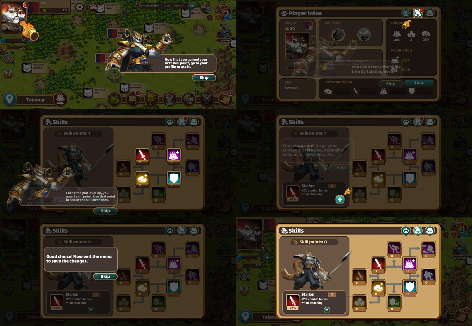
And until now we’re still iterating and improving it with the help of our users’ feedback.
2. UI improvement
When I joined the team I first started by improving the existing UI. Here is an example of UI improvement I did for the game.
Version 1
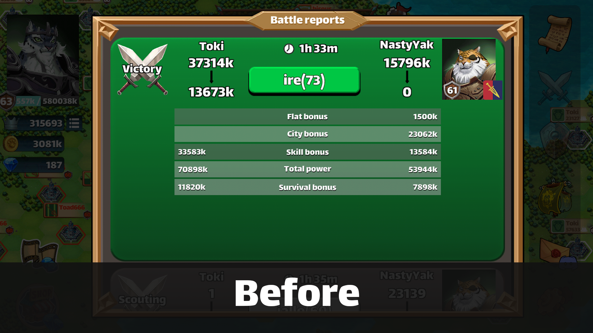
In Million Lords, you send your armies to enemy cities to attack and conquer them. After the battle, every player receives a detailed battle report with a summary of what happened exactly in the battle, it’s a really important feature in the game.
The first version Million Lords used was confusing, the players didn’t understand it because it wasn’t clear enough. The labels used: “flat bonus”, “city bonus”, “total power” weren’t understandable, and the numbers showed didn’t have any unit and were too complicated to understand.
Version 2
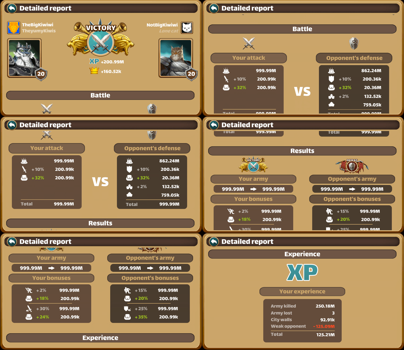
First, I decided to make the battle reports into a full scrollable page with more information and visuals. I divided it into parts separating the battle summary, the skill bonuses, and the experience so that each part can be individually displayed on the screen and shared on social media through screenshots.
In the battle summary, the players can see the damage done by both their armies and their opponents’. In the skill bonus part, the players can see their skill bonuses and their opponents’. In the experience part, the players can see the bonus multiplier and how many experience points they got by killing their opponent’s armies and by losing their own armies.
Version 3
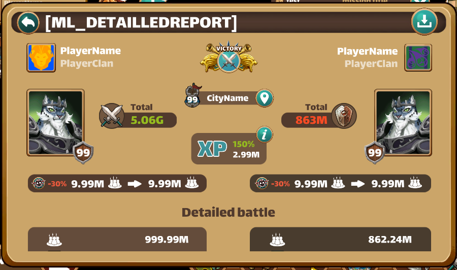
After some tests and feedback, I improved the UI again by making it more compact and adding a screenshot button that instantaneously takes the whole detailed report so that players can share it directly on social media. I also added a section with equipped items so that the players can immediately know if they were using the right items or not in a battle. One of the most asked improvements was to summarize the battle at the top of the report so that the players did not have to scroll to get the most important information they needed first.
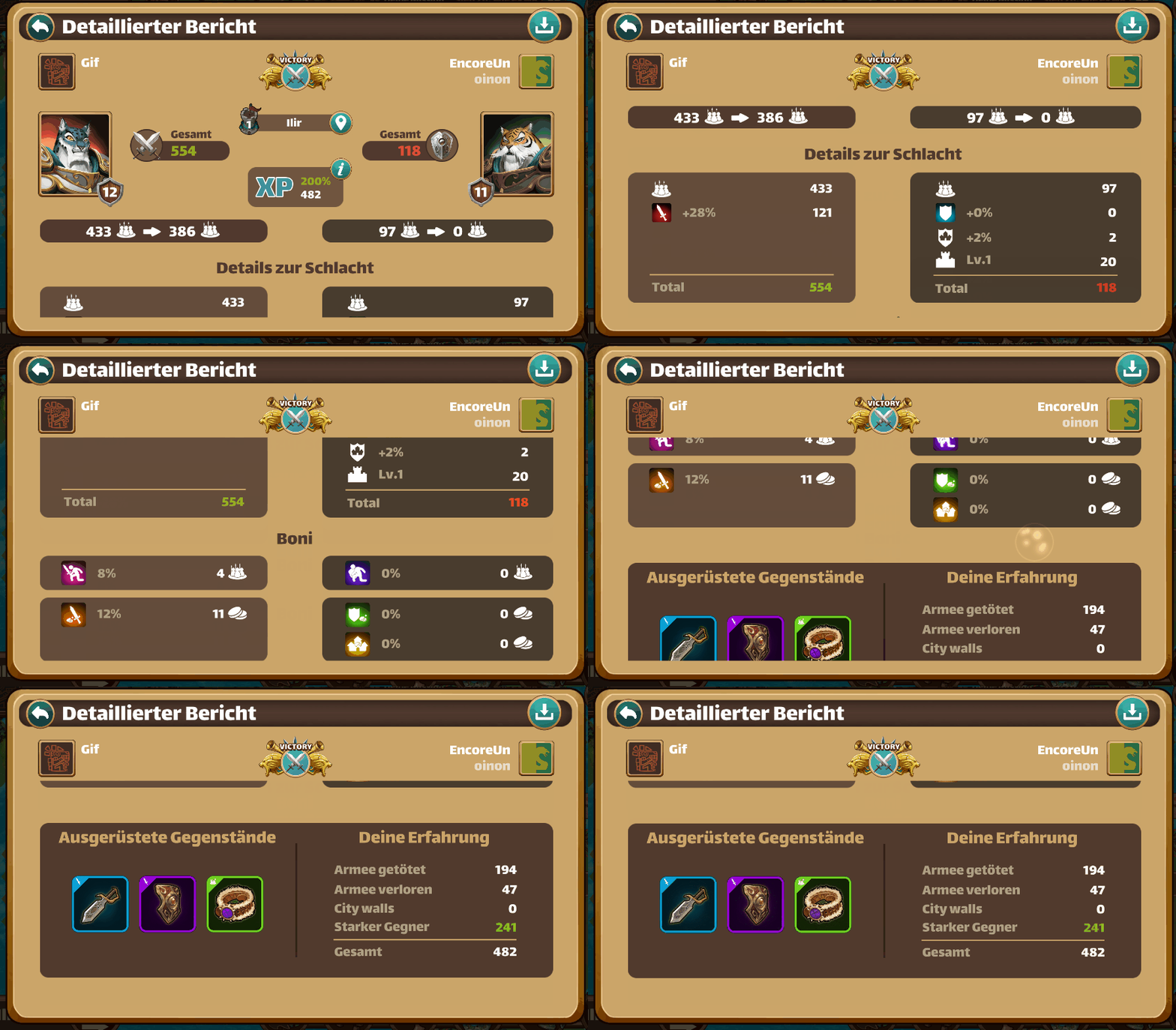
Players are quite satisfied with this new version, the next improvement we planned to do in this panel is adding tips in case the player loses so that they can have a better chance on winning the next battle.
3. UI design from scratch
One of the first features I had to design from scratch was the shop of the game.
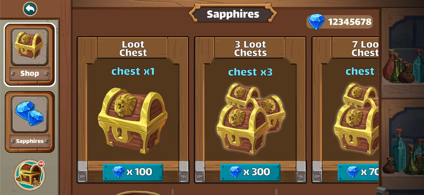
Version 1
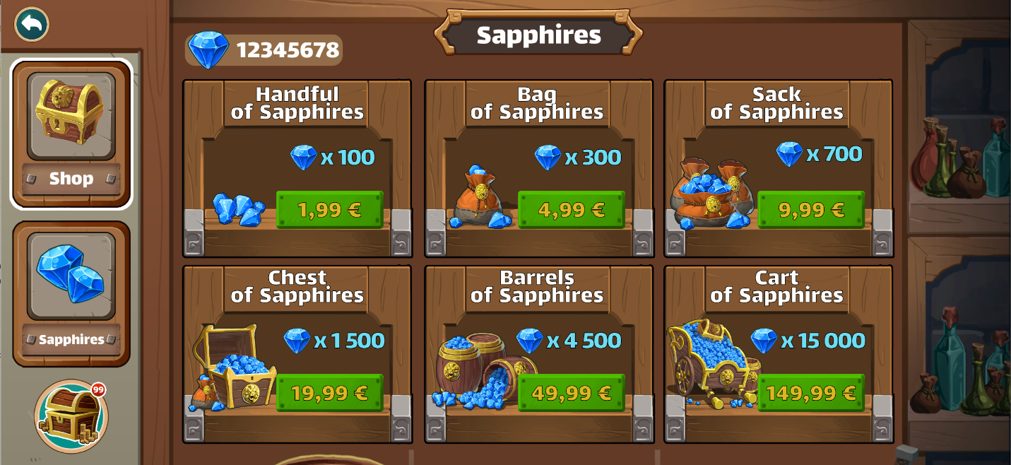
The shop was originally made of two tabs: a sapphire tab, in which you could buy hard currency, and a chest tab, in which to spend the hard currency. Chests are surprise boxes, that contains five random items, and players can get them every five levels or buy them directly in the shop.
Version 2
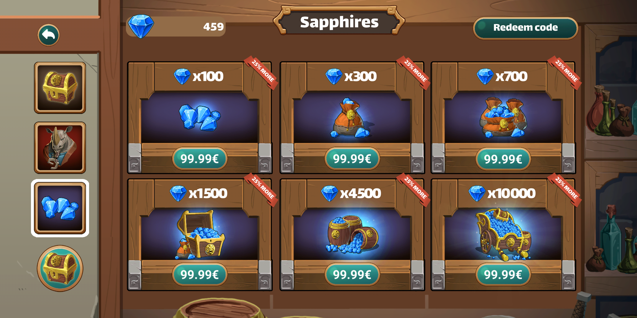
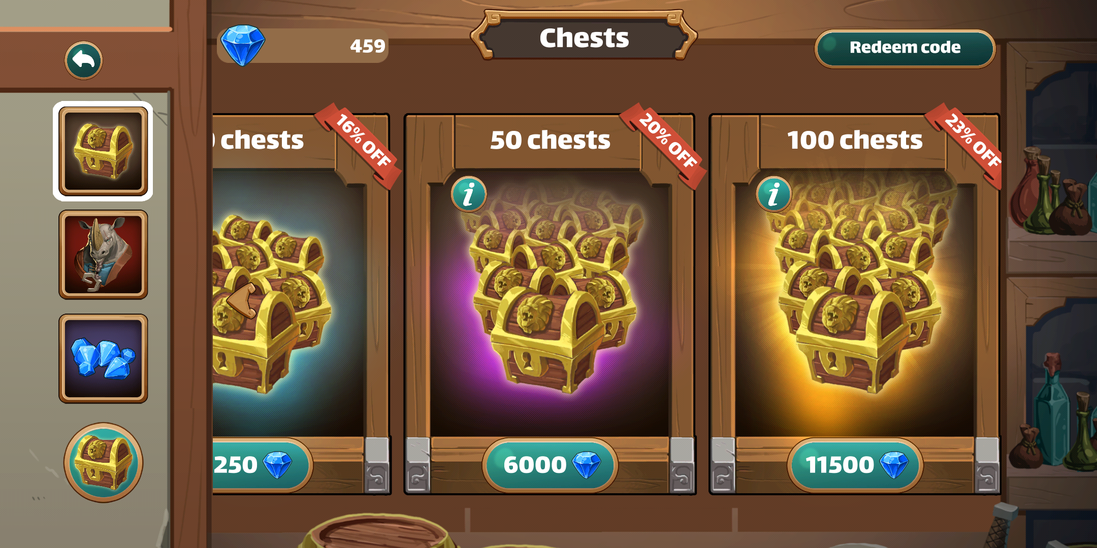
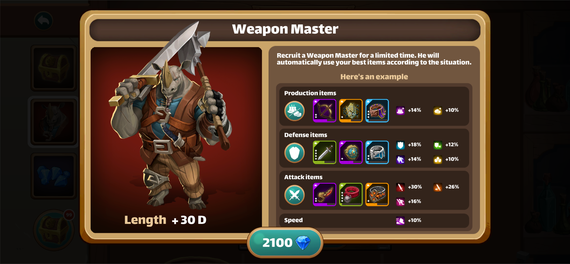
After some time we added a new feature: advisors. Players can recruit them for a limited time to help them conquer the Three lands, so we needed a new tab on the shop, I used this opportunity to iterate and make the shop more colorful to give a special color to each category and added some Particles Fx to make the items more attractive.
Information panel
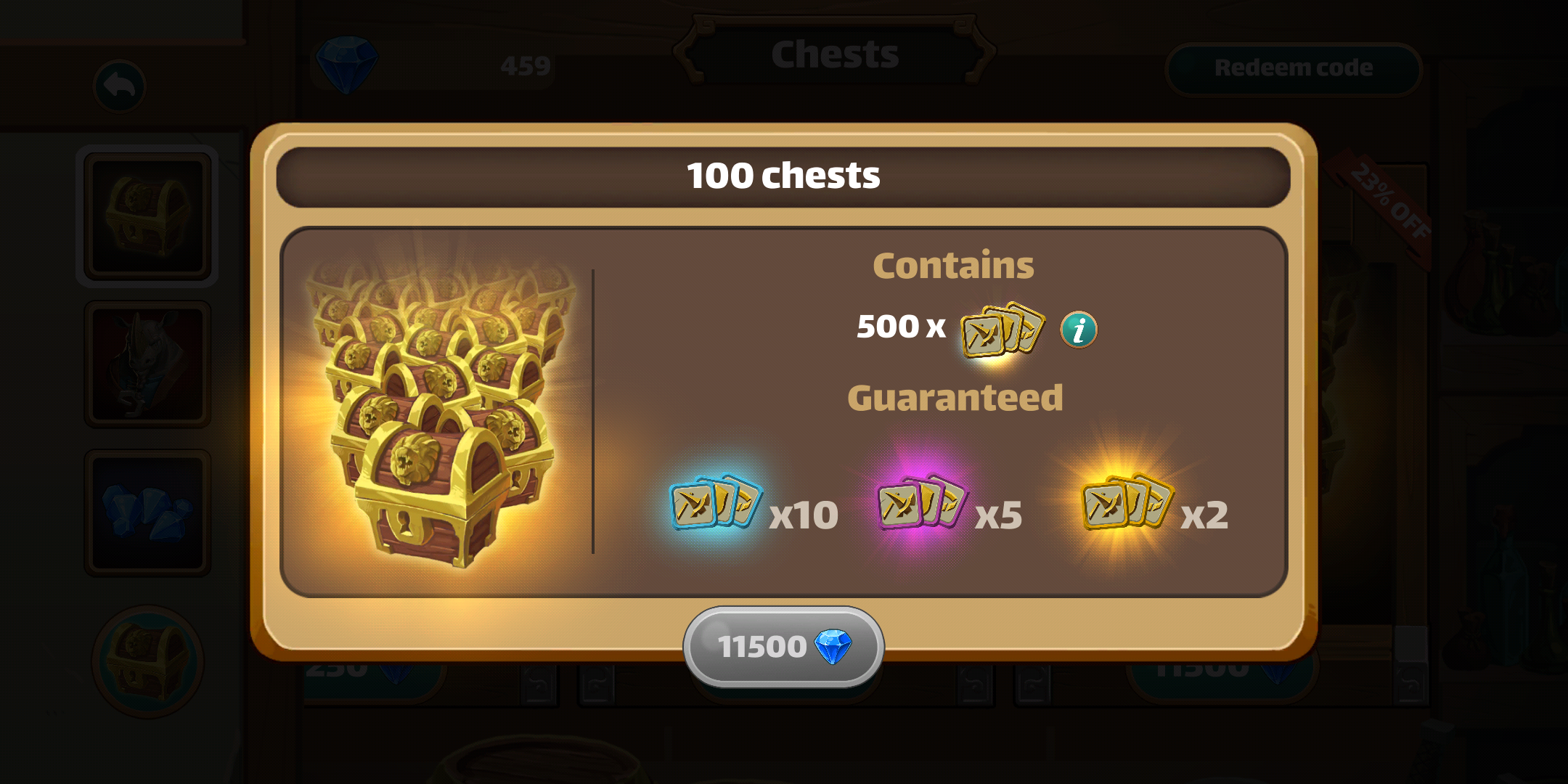
In addition, we added a new detailed panel for each option so that the players can have all the information they need before buying a chest or recruiting an advisor.
Version 3
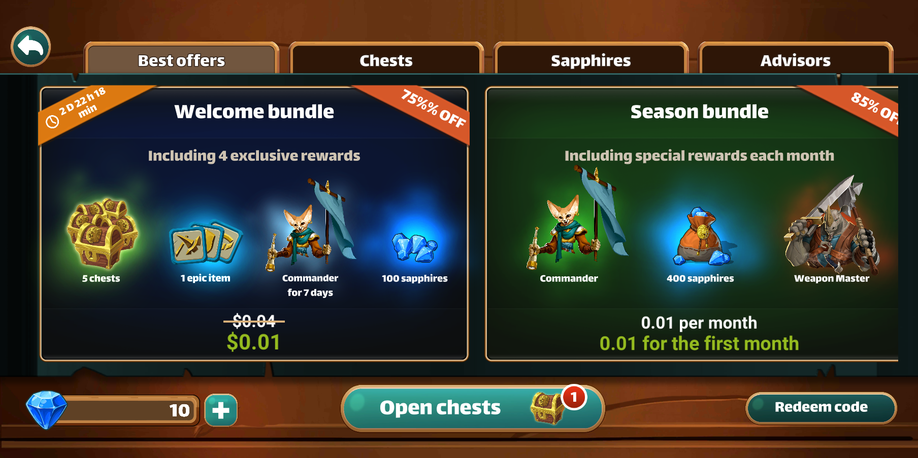
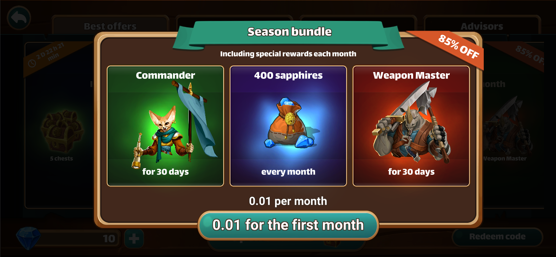
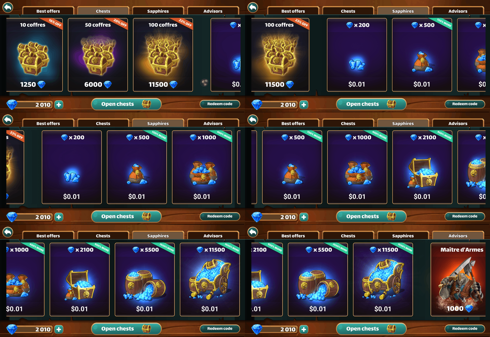
In the last version of the game released, Million Lords offers packs: one type of pack is available once per player and another can be subscribed to. This new feature required a new tab and the last design wasn’t good enough: we needed a new experience and a shop that could take more changes in the future. I set out to create a new version of the shop with a different User Flow.
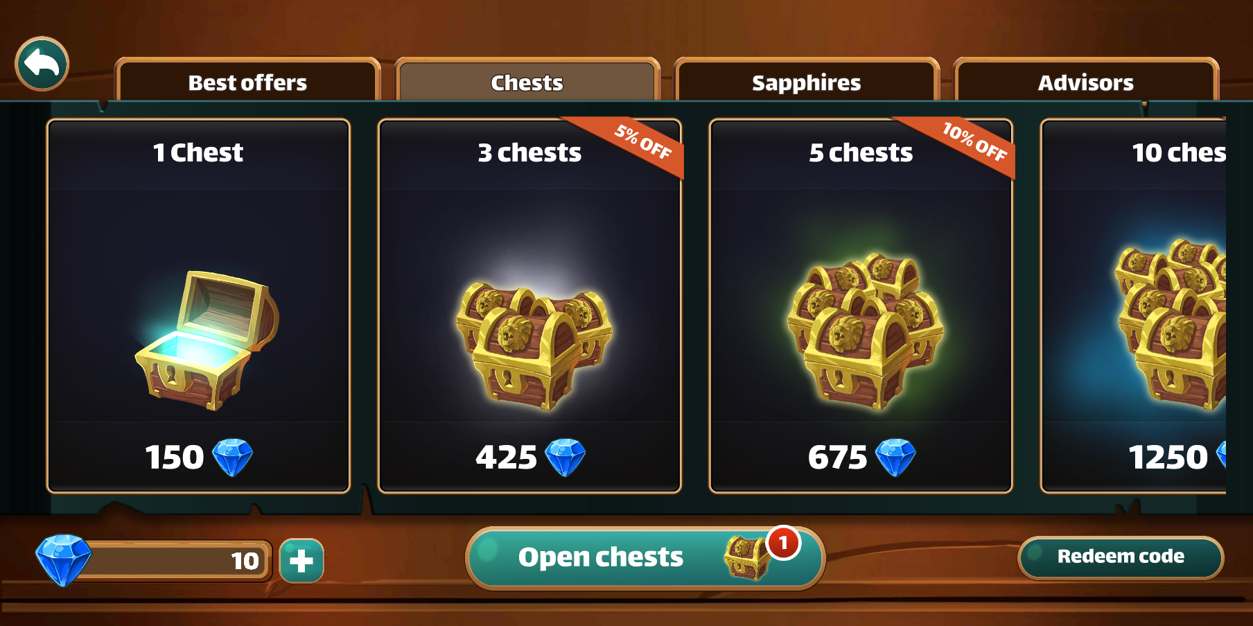
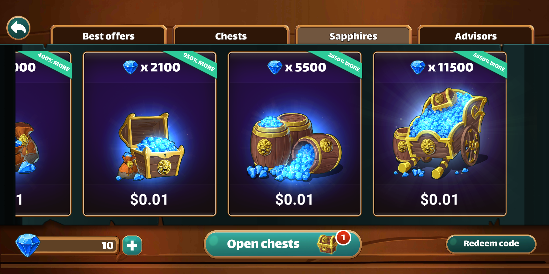
The shop is now fully scrollable horizontally, new tabs and new items can be added to it smoothly without altering the User Experience every time. The players can either scroll until they find what they’re looking for or directly tap on the tab they need to get what they want. In addition, the options now have a button effect on them so that the players understand that it’s all interactive. I also changed the colors to make them look more appealing and luxurious.
4. Integration and optimization
After the validation of the designs I integrate them directly on Unity, the game engine and optimize the assets to the best of my ability to keep the app lightweight while keeping them in good quality. Here are some examples:
Integration
I integrate my designs directly on Unity and save prefabs that I push on the project’s git. After that, the gameplay programmers only have to use the prefabs for the UI and can code the features on them.
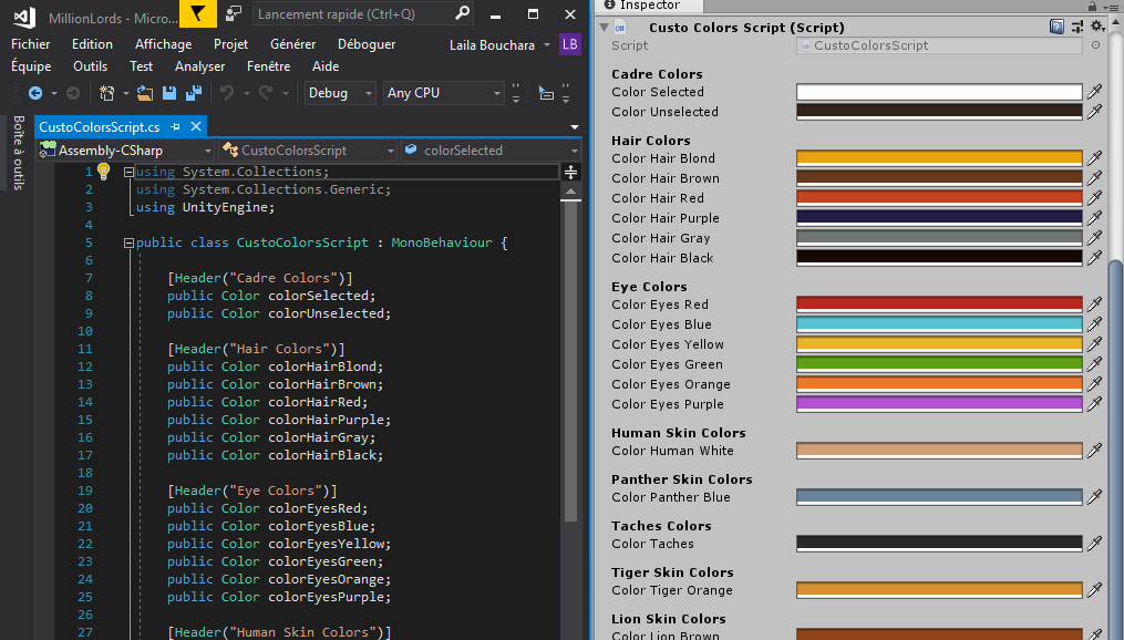
If there are colors that are used multiple times I create a script and I reference the colors in it to make them easier to find and easier to change if needed.
Frames optimization
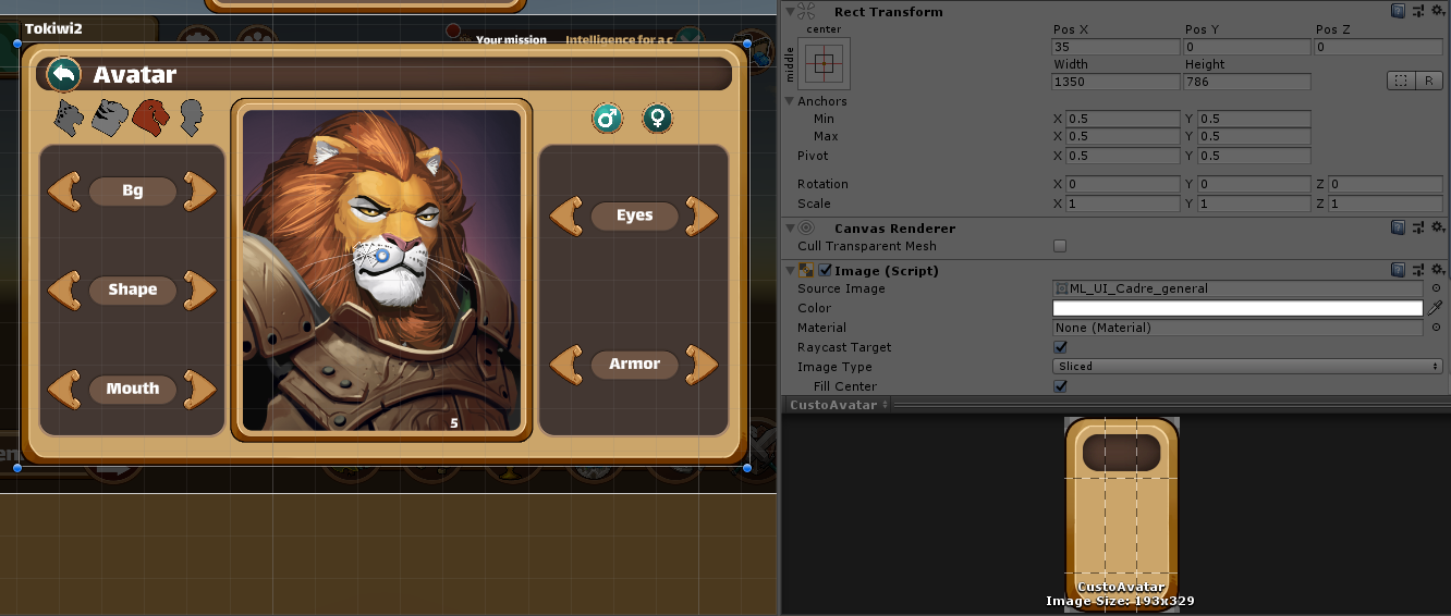
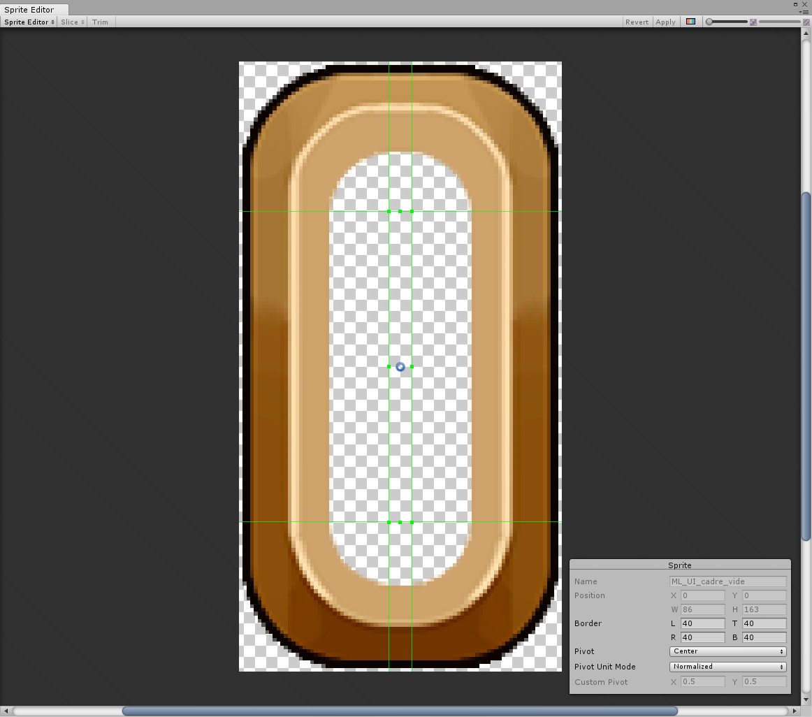
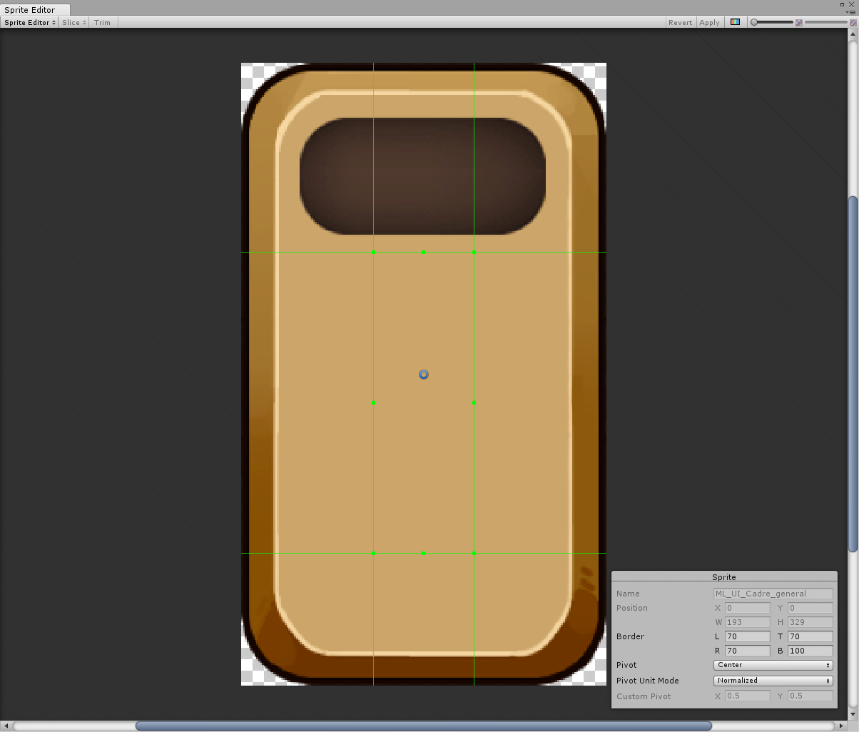
On Unity, it is possible to slice an asset to keep the corners and stretch the middle of the asset. This can be used on game frames to keep the rounded corners intact and stretch the gradient in the middle.
It makes the size of the asset smaller (when compared to the real size) and makes it reusable in different sizes depending on the situation.
![]()
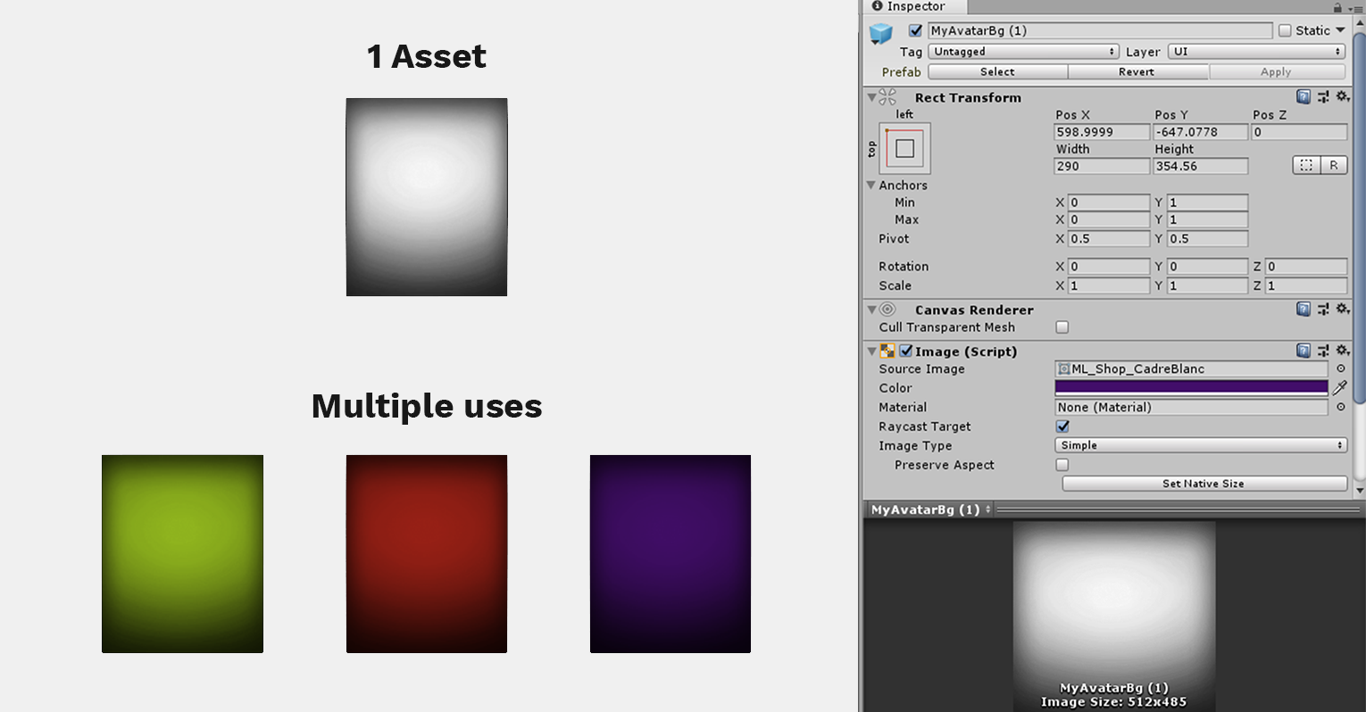
Monochrome assets optimization
An asset can be used multiple times with different colors in game. To optimize it and avoid having multiple assets, a single gray-scale image can be used and its color can be changed directly on Unity. This can be very useful for backgrounds, icons and monochrome assets in general.
![]()
Software used

Photoshop

Illustrator
Adobe Xd

Unity

Gitlab

